- Culture
- Public
- Transformation
- Interior
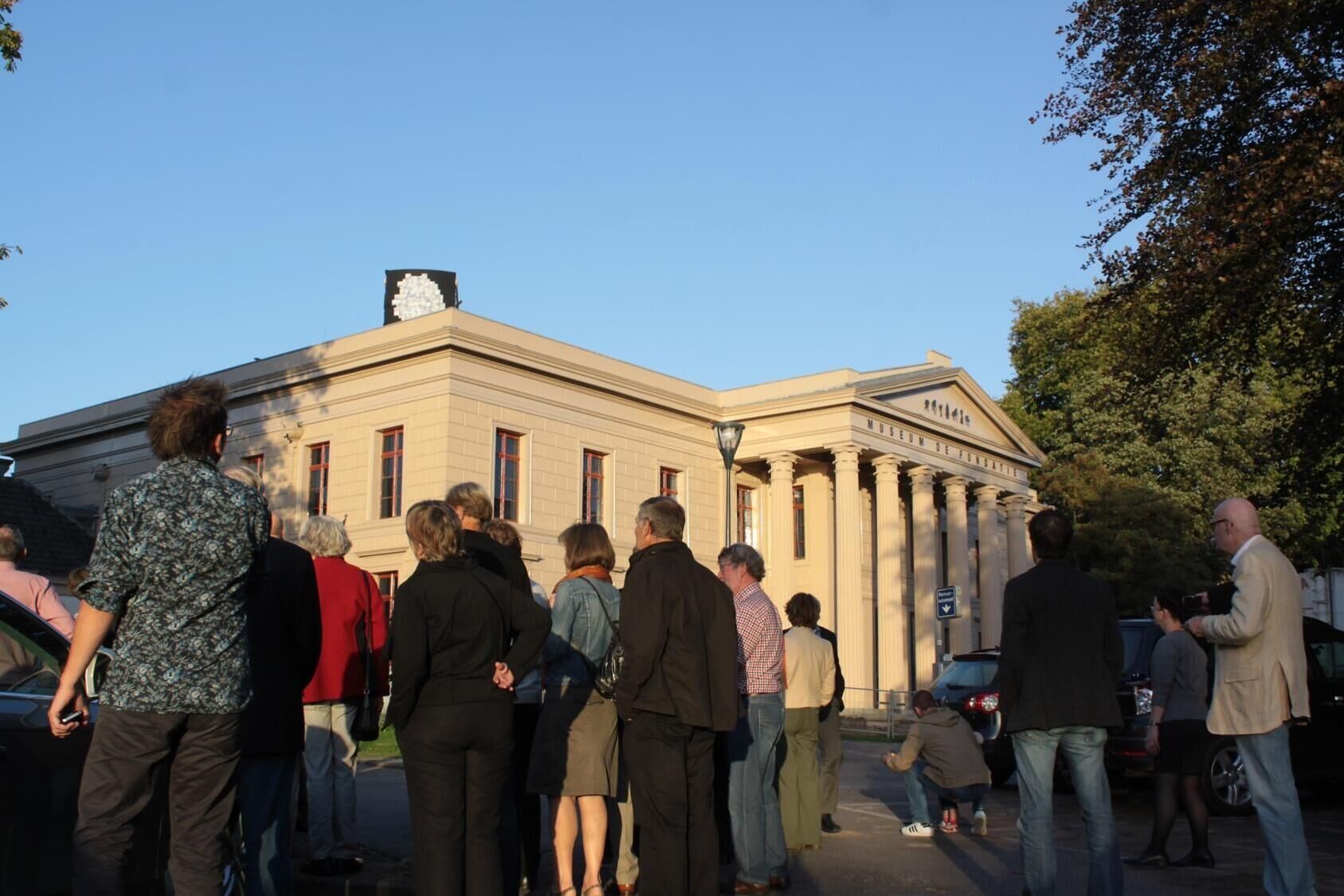
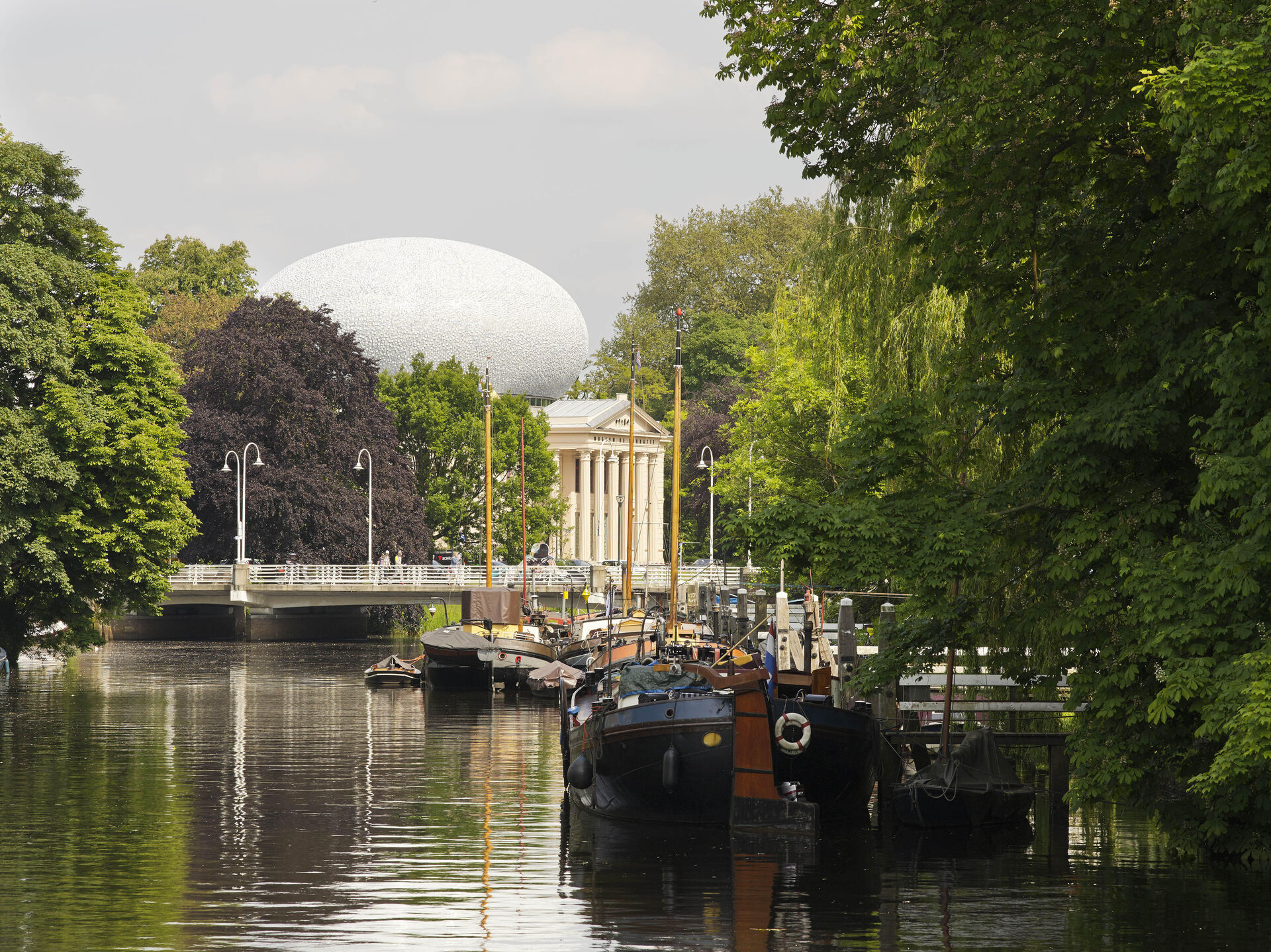
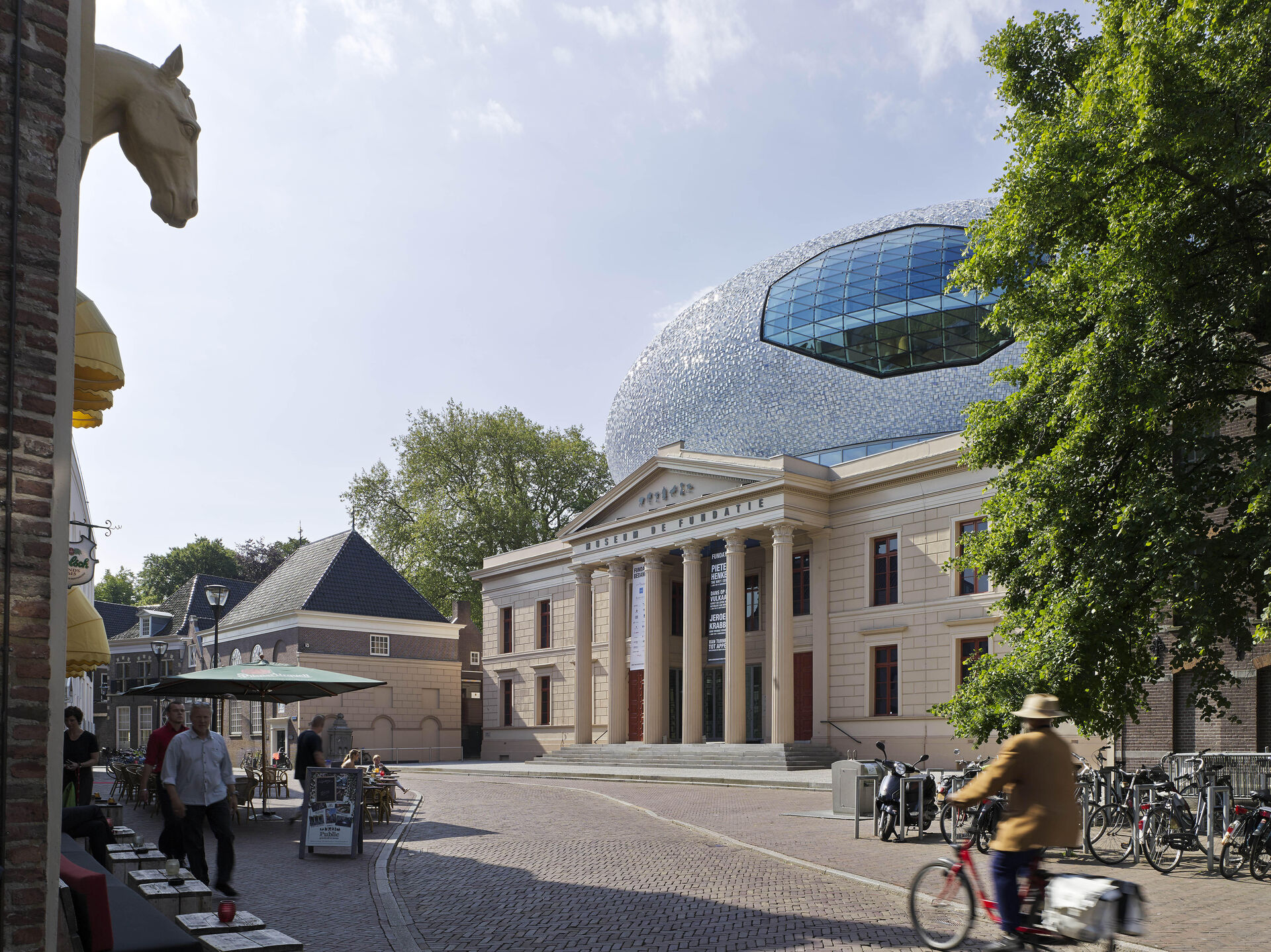
Museum De Fundatie in Zwolle, in a former Palace of Justice located on the boundary between the medieval city centre and the open 19th-century canal parkland, has been extended by a spectacular volume on its roof.
The law courts on the Blijmarkt were originally designed by architect Eduard Louis de Coninck in 1838 in a neoclassical style. De Coninck’s task was to symbolise the unity in the legislation of the new kingdom through this architectural style. The building has a double symmetry featuring monumental entrances on both sides and a central entrance lobby on two floors. In 2004 the former law courts were repurposed into a museum (by architect Gunnar Daan), whilst the new extension was designed in 2010 by BiermanHenket Architects. Hubert-Jan Henket was able to persuade the client not to extend adjacent to the existing building, as this would have destroyed the solitary and symmetrical character of the building. An underground extension was too spatially complex. The extension was therefore designed as an autonomous volume on top of the monumental building.
- Design: 2010
- Client: Museum de Fundatie, Gemeente Zwolle
- Location: Zwolle
- Delivery: 2013
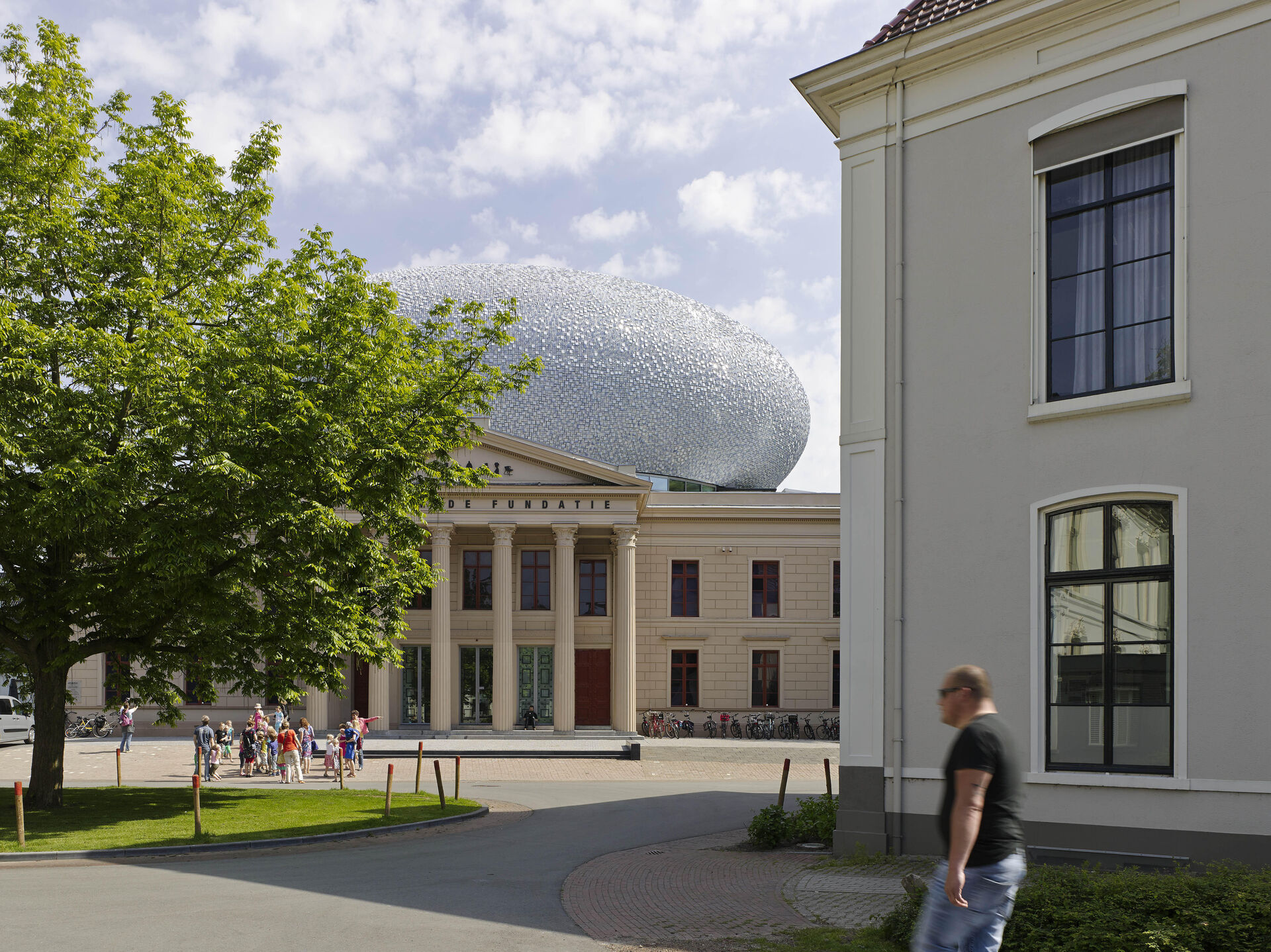
The museum has a remarkable collection, featuring work by painters from Rembrandt and Saenredam to Turner, Monet, Rodin, Van Gogh, Mondrian and Van der Leck. It also organises small but high-profile exhibitions. Under museum director Ralph Keuning, the temporary exhibitions grew to be so successful that extension of the museum became necessary. The museum resisted the temptation to leave the historic city centre, where it is difficult to extend, and has opted for an extension of the current listed building.
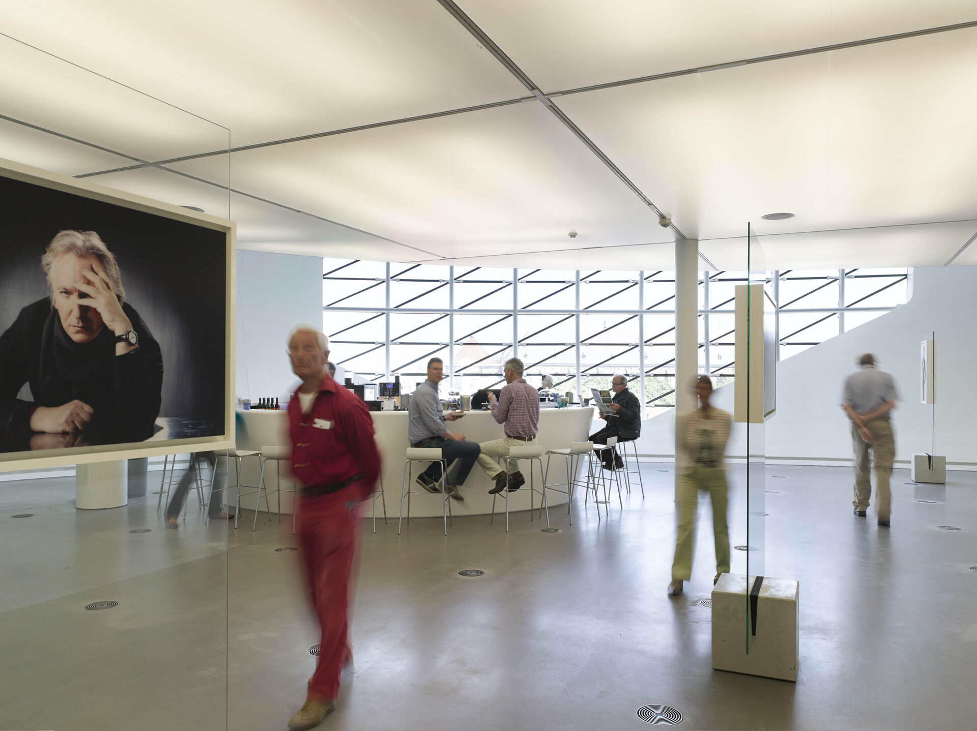
Like the lower section, the new extension is symmetrical in two directions, but unlike the lower section, its shape is reminiscent of a rugby ball. Together the two completely different volumes form a new urban entity. The interior too reflects two contrasting approaches: the classical sequence of rectangular galleries below versus the flowing open spaces in the elliptical space above.
Both the Rijksdienst voor het Cultureel Erfgoed (RCE; Cultural Heritage Agency of the Netherlands) and the local heritage organisations responded positively to the radical concept for this extension from the very first sketches. Under the motto of ‘conservation through development’, the usual debates and (consultation) processes were significantly shortened. Planning permission was secured in record time.
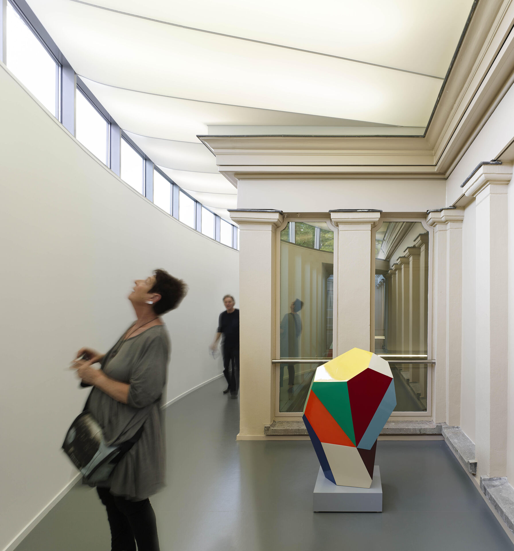
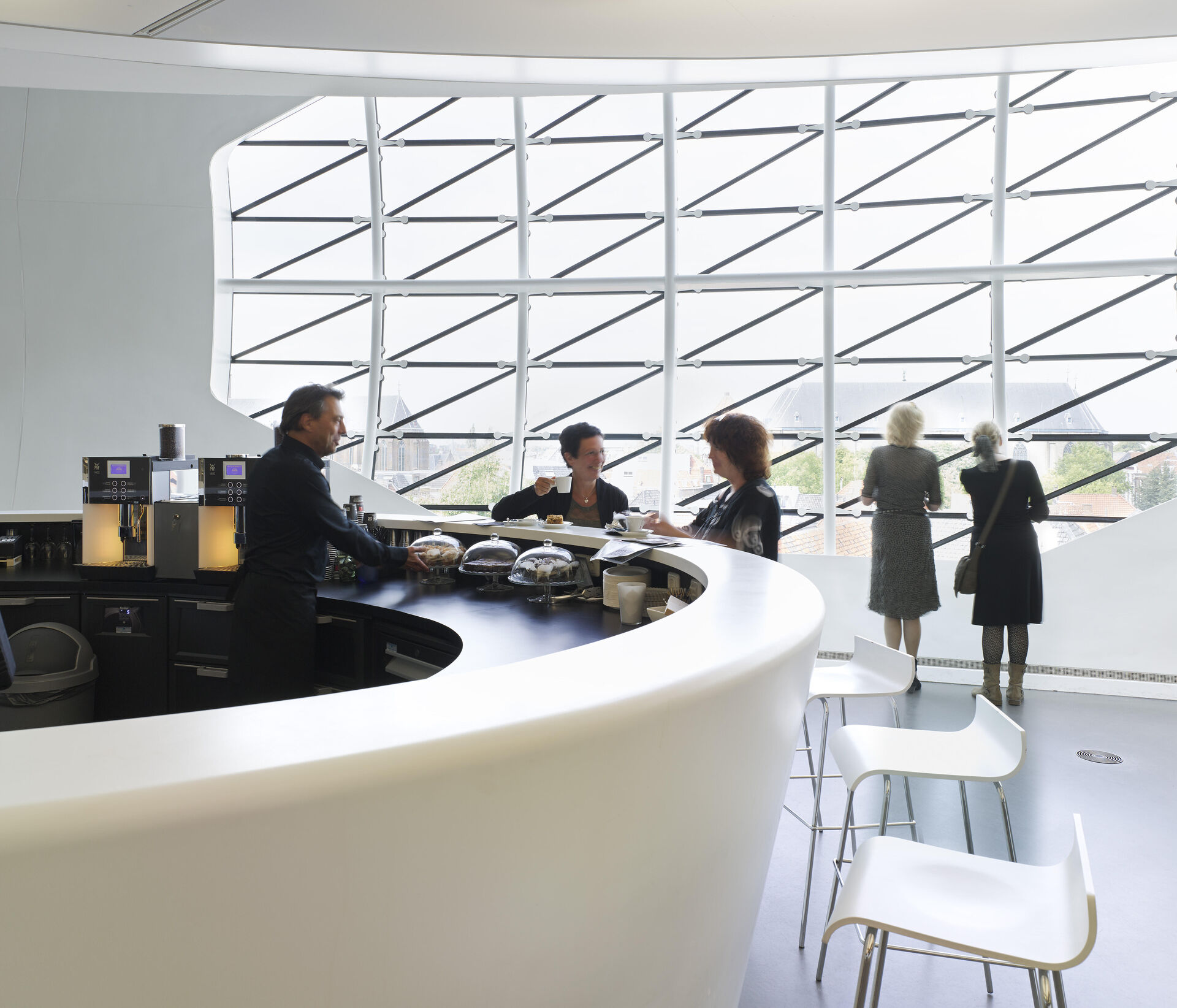
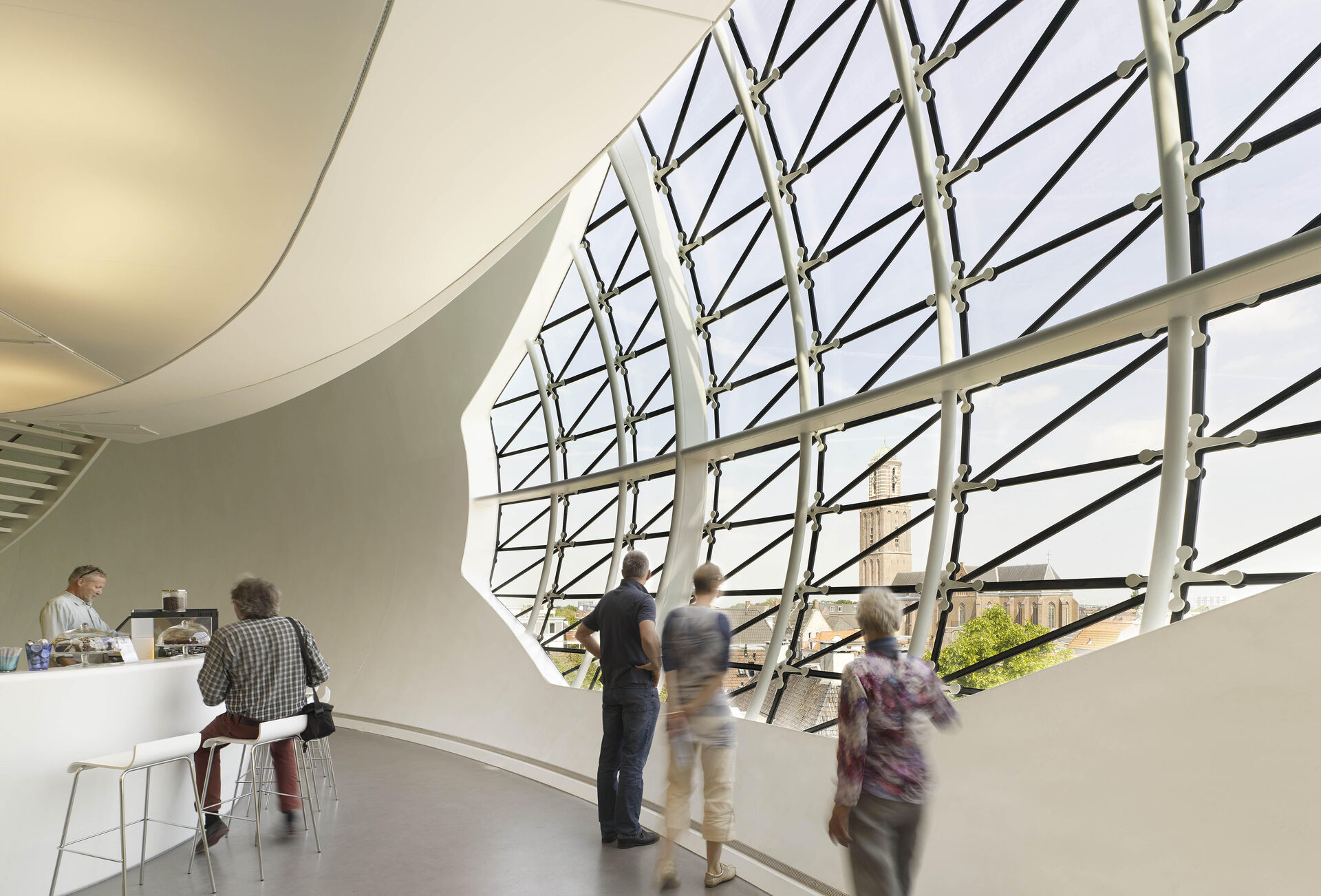
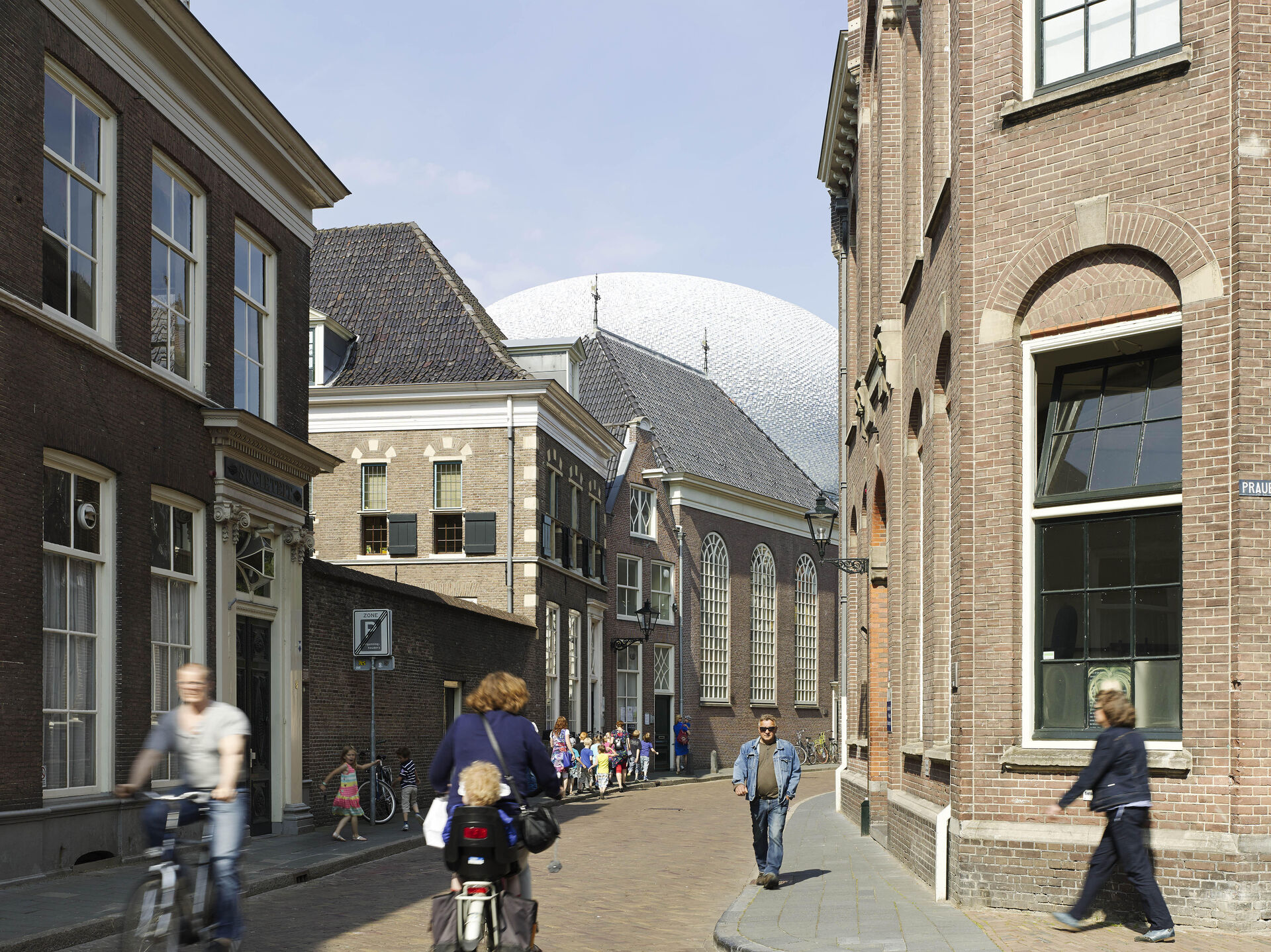
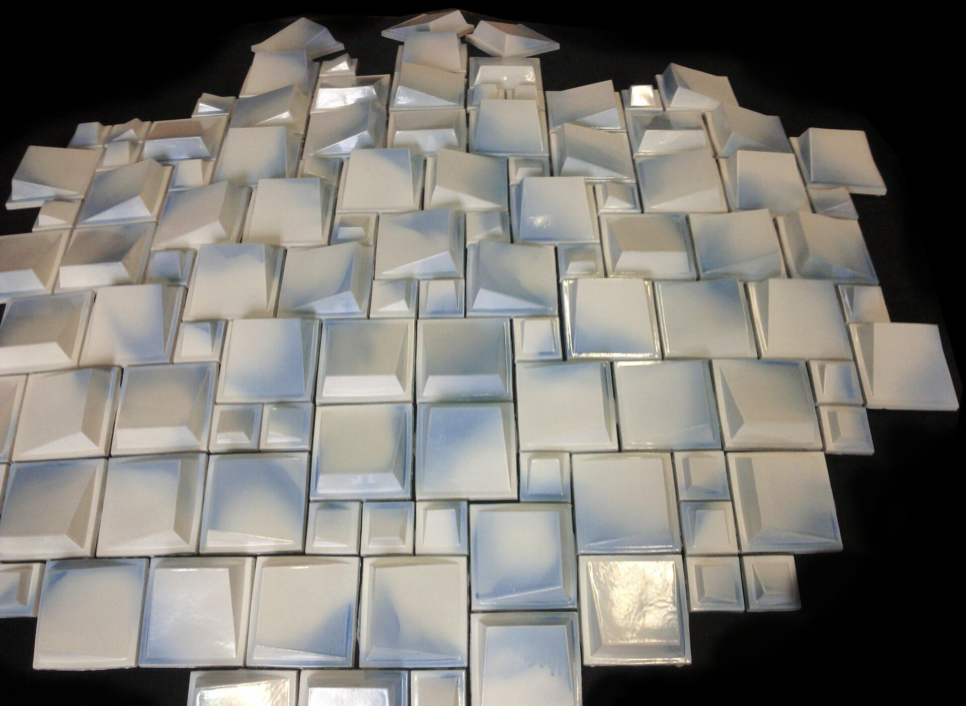
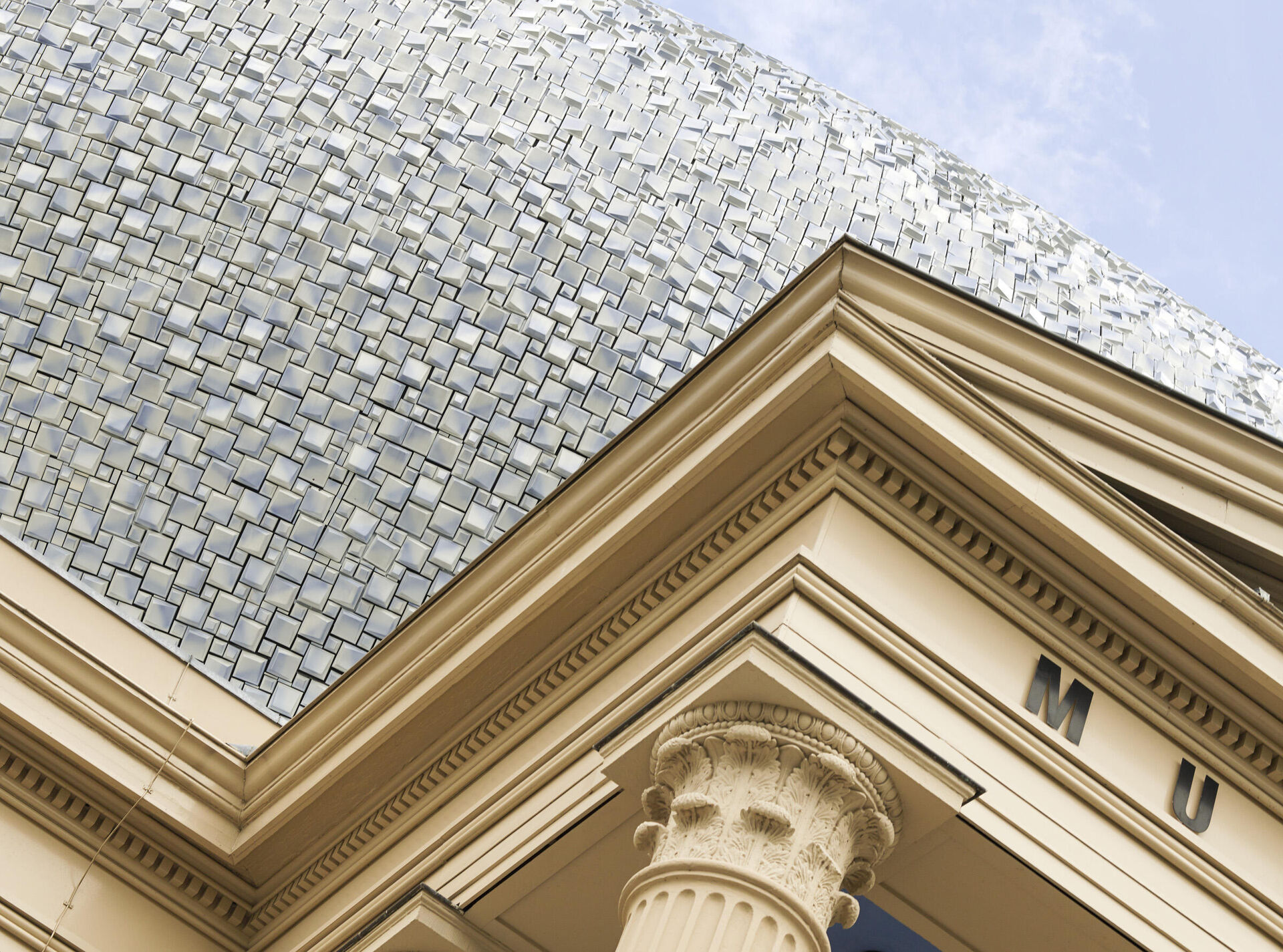
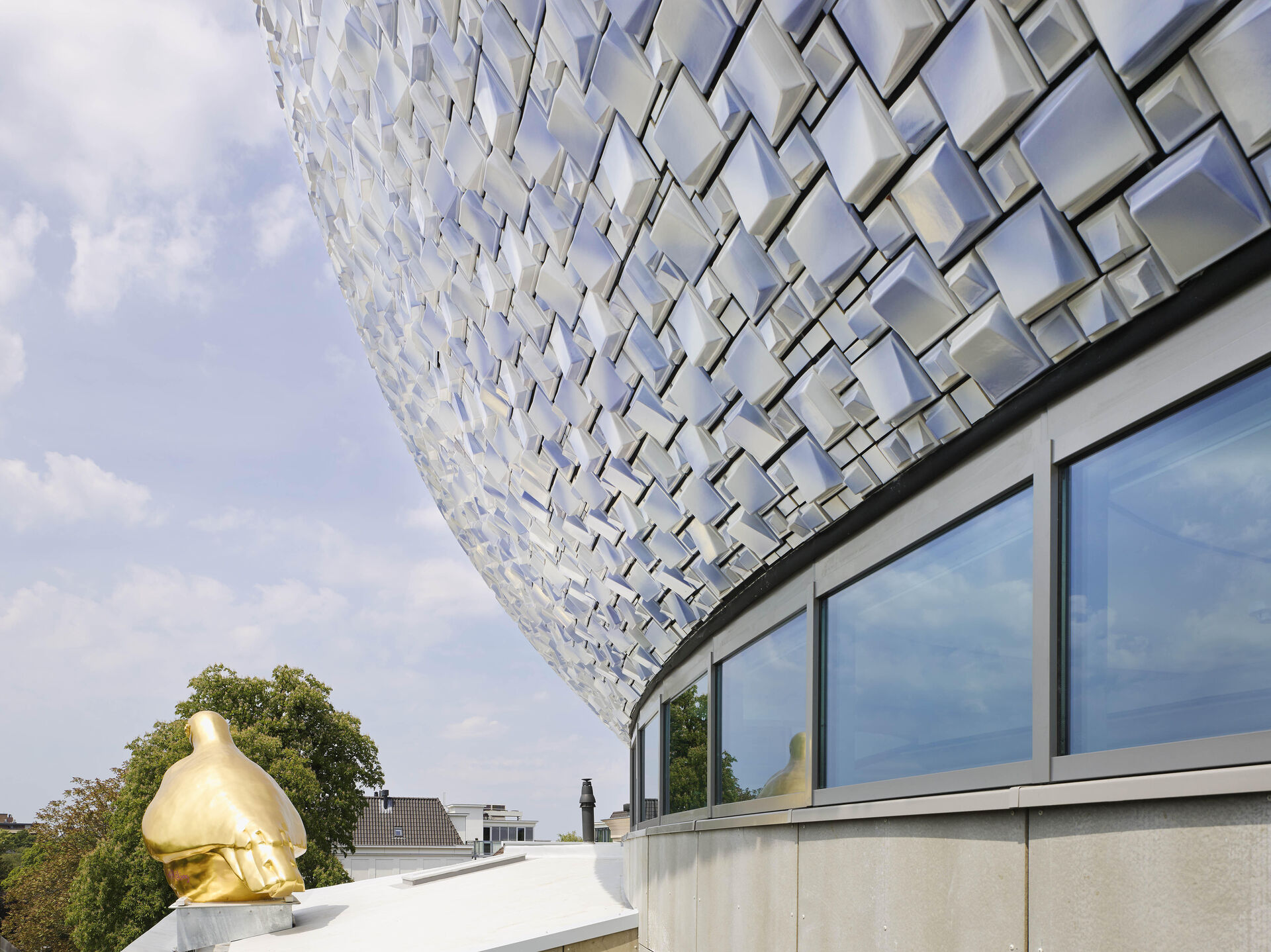
Eight steel columns with their own foundations have been installed straight through the building. The columns bear the weight of the new extension, which contains gallery floors of 1000 m2 in total. This means the extension is structurally and architecturally independent of the old Palace. The extension has been cladded with 55,000 three dimensional ceramic elements produced by ceramics experts Koninklijke Tichelaar in Makkum. The mixed-white-blue glazed 20x20 cm and 10x10 cm tiles together form a nuanced surface which works to blend into the sky in different weather types. On the north side, a façade has been created which provides the two new museum floors with daylight and affords a panoramic view of the city centre from the museum.
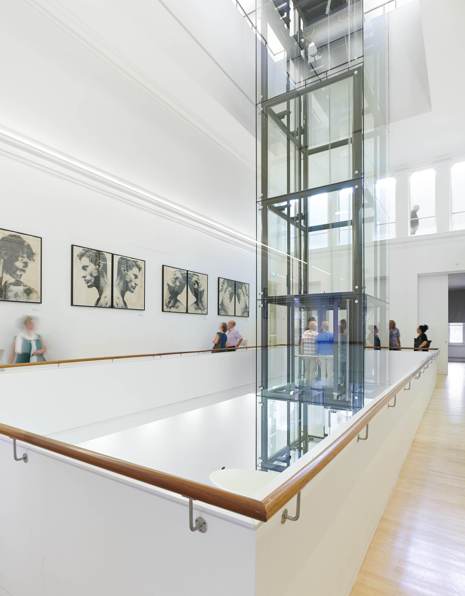
The original central entrance lobby has been continued in the extension in the form of an atrium, bringing the two museum worlds together. A glass lift in the atrium takes visitors to the different floors. The staircases are located away from the centre, on the edges of the various floors. In the oldbuild, they are stately and straight, in the newbuild they are flowing and curved. A glass corridor runs between the existing building and the extension on the interface of new and old. On one side the view is into the atrium, on the other side it is into the city and the bottom of the tiled extension. Museum de Fundatie, whose aim is to present contemporary, modern and older art in a single building, has thus been given a new and completely unique look.
